
The Prussian Blue of the Evening Sky
- 15 hours ago
- 3 min read
Having watched numerous videos about Japanese woodblock printing, one comment appears again and again: bokashi (the gradation) is the most difficult part of the process. Traditionally, it is often left until the end. Yet as I began printing this view of London, it quickly became clear that I had to start with the sky and this gradation technique.
The reason was simple. The sky determined the atmosphere of the entire print.
Choosing colours for a woodblock print is very different from painting. In a painting, all the colours develop together on the same surface. In woodblock printing, each colour is prepared separately, often without seeing the final result. It is rather like conducting a symphony one instrument at a time.
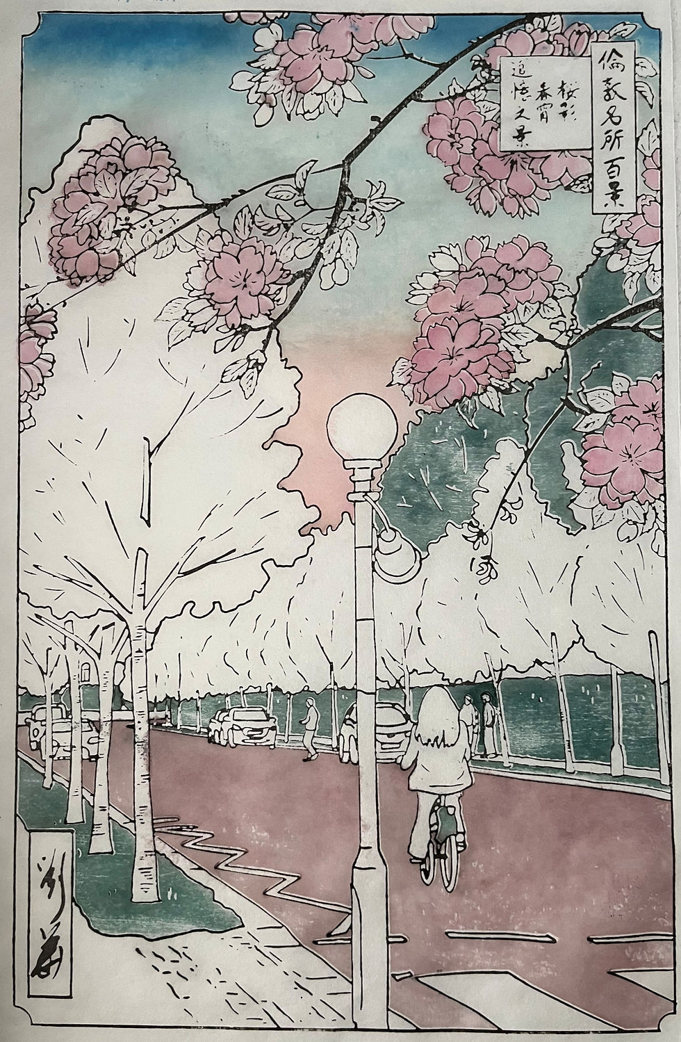
A pale blue sky might look convincing against white paper, but once dark green trees are printed beneath it, the same blue can suddenly appear weak and lifeless. The sky therefore had to establish the overall tone before any other colour decisions could be made.
I found myself torn between two traditions.
The first was the dramatic sky of the Edo-period landscape print. In the works of Hiroshige, a deep band of blue often occupies the upper edge of the composition, balanced by a warm safflower-red glow along the horizon. It is not a naturalistic sky so much as a poetic one. The colours are heightened and stylised, creating an emotional atmosphere rather than recording a literal moment.

The second approach was that of the shin hanga artists of the early twentieth century. Their skies often possess subtler gradations and a greater sense of observed light. While still poetic, they can feel closer to a real evening sky.

In the end, I chose a position somewhere between the two traditions: neither fully Edo nor fully shin hanga.

My paper presented the first challenge. The brilliant white surface felt too modern and sterile. To create something of the warmth found in older prints, I first printed a delicate yellow haze across the sky area. This immediately softened the paper and removed the harshness of the untouched white.
Next came a band of red at the horizon. At present I am using Winsor & Newton watercolours, but I hope eventually to experiment with traditional pigments. I would particularly like to try safflower red (beni), which played such an important role in Edo-period colour printing. Before the introduction of stable synthetic dyes, reds were often derived from plant sources like safflower. These pigments could be luminous but were also notoriously fugitive, sometimes fading significantly over time, which is why surviving impressions from the period can vary so much in their warmth.
The blue itself required several stages. Across the upper-middle portion of the sky I printed a very dilute mixture of cerulean blue and French ultramarine. Over this I added a stronger bokashi at the top using diluted Prussian blue.
Prussian blue has a particularly significant history in Japanese printmaking. It was a synthetic pigment developed in early eighteenth-century Europe and later imported into Japan through Dutch trade at Nagasaki. Before its arrival, landscape prints relied on natural mineral and plant-based blues such as indigo and dayflower pigment. These earlier blues could be subtle and atmospheric, but they were often unstable: some would fade over time, while others lacked the depth and consistency needed for strong tonal modelling in large landscape compositions.

Prussian blue changed this entirely. It was intensely saturated, remarkably stable, and could be printed in both dense and highly diluted forms without losing clarity. Japanese artists quickly recognised its potential, and by the early nineteenth century it had become central to the visual identity of ukiyo-e landscape printing. In the hands of artists such as Hokusai and Hiroshige, it defines entire skies and seas, often forming a bold structural band of colour at the top or edge of the image.
I have not yet been brave enough to use it at full strength. My own version remains more restrained, but even in dilution it carries something of that history: a pigment that once transformed how Japanese artists represented distance, weather, and atmosphere.
The print itself stands somewhere between Edo and shin hanga, between stylisation and observation. The sky became the place where those two traditions first met.


Comments