
The Hidden Layers of a Woodblock Print
- 8 hours ago
- 2 min read
For the past two months, I've spent almost every evening working on the colour proof for my Regent's Park Blossoms woodblock print. It has been one of the most rewarding - and frustrating - stages of the project.
The problem was this. I'd mix a colour, print it, and think, Yes, that's it. But then the paper would dry. Suddenly, the colour had lost its energy. It wasn't wrong, exactly, but it seemed to have faded. The richness I had seen moments before had disappeared, leaving the print looking flatter and less luminous than I had imagined. I kept comparing each proof with my original digital colour sketch, trying to understand why they felt so different. Every evening I adjusted the pigments, printed another proof, waited for it to dry, and hoped for a breakthrough.

It became increasingly frustrating. I began wondering how a print that looked so subdued on the workbench could ever command attention on a gallery wall.
Then I remembered reading about a technique used by the great twentieth-century Japanese printmaker Ito Shinsui. In one of his most celebrated prints, depicting a woman applying her makeup, the deep red background was not achieved with a single printing. Instead, the same block was printed three times to build the richness of the red colour.
Perhaps, I thought, I had been expecting too much from a single impression.

So I began experimenting.
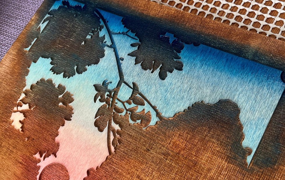
The trees in my print were printed twice. The road was printed three times. The pavements and tree trunks were each printed twice. Even the sky, which appears quite simple, is actually built from five separate printings: a soft yellow haze, an orange horizon, a blue middle sky, a Prussian blue bokashi gradation, and finally a delicate red printed over the horizon to warm the evening light.

Then it came together. Rather than trying to force intensity from a single layer of pigment, the colour began to build naturally. Each impression added only a little, but together they created a depth and luminosity that simply hadn't been there before. Instead of appearing heavier, the colours seemed to glow from within, as light continued to reflect through the transparent layers and the white of the paper beneath.
It was a reminder that Japanese woodblock printing is an art of patience. What appears to be a simple image is often the result of countless small decisions: mixing pigments, judging the moisture of the paper, registering each impression with precision, and sometimes printing exactly the same block again and again until the image finally comes alive.

There is still much to refine, but this proof taught me something I suspect I'll carry into every future print. Sometimes the answer is not to use more colour, but to build colour more thoughtfully. The most satisfying discoveries are often the ones that arrive only after weeks of frustration.


Comments