

Hokusai's Palette, My Palette: Choosing Pigments for Modern Woodblock Prints
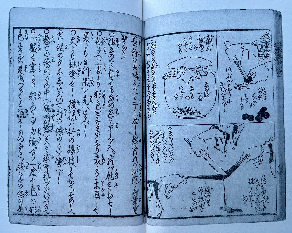
Recently, out of curiosity to understand what pigments people in the Edo period used for woodblock prints, I have been reading Mad About Painting, a translation of Hokusai's remarkable painting manuals. Alongside lessons on drawing and composition is a fascinating glossary of pigments and painting techniques: a rare glimpse into the practical world of an artist's workshop two hundred years ago. The more I read, the more I realised that Hokusai's greatest lessons were not simply about colour, but about the way an artist should think.
One of the first surprises is how restrained his palette really was.
Rather than relying on dozens of ready-made colours, Hokusai, and other artists of the Edo period, created an extraordinary range of hues from a relatively small number of pigments. His green, for example, was often awasegusa, literally "blended grass", made by mixing orpiment with indigo wax. His soft yellow, kino-gu, was orpiment combined with shell white. Pale blue-green came from indigo wax mixed with shell white, while purple was made by combining Prussian blue with a reddish-purple pigment called kienji.
What struck me was that Hokusai wasn't searching for more colours. He was searching for better relationships between colours.
His notes are wonderfully practical. Describing byakuroku, a pale green, he writes that every pigment has a different quality and that the artist should strengthen or weaken the mixture depending on the character of the pigments being used. There is no rigid formula. Observation and judgement matter more than recipes.

Elsewhere he describes ayakari, the practice of adding just the slightest amount of another pigment to shell white so that it takes on a watery appearance. Such a tiny adjustment prevents white from becoming flat or chalky. It is a reminder that the most subtle decisions often have the greatest effect.
His instructions for painting yellow are equally revealing. He recommends first applying an even coat of kino-gu, then adding shell-white lines, before finishing with a shell-white gradation. Colour is built patiently in layers. Likewise, for crimson, he recommends laying down a base colour before applying a gradation of darker red. Light is not simply painted on top; it is woven into the colour itself.
Reading these pages, I began to appreciate that Hokusai's art was not dependent on exotic materials. It depended on understanding them.
Of course, some of those historical pigments present obvious challenges today. Orpiment, his principal yellow, contains arsenic. Vermilion contains mercury. White lead and red lead are, by modern standards, hazardous materials. They produced beautiful colours, but they belong to a different age.
This left me with an interesting question.
How traditional should a twenty-first-century woodblock artist be?
For a while I was tempted to recreate an Edo-period palette as faithfully as possible. Yet the more I reflected on it, the less convinced I became that this was the point.
Instead, I have decided to use a small number of traditional pigments where they offer something truly unique.

One is beni, the crimson dye extracted from safflower. I hope to use it for the distant horizon in my prints. Its delicate, luminous glow has captivated Japanese artists for centuries and seems perfectly suited to those fleeting moments at dawn or dusk.
Another is gamboge, which I intend to reserve for the warm light of a lantern. Historically derived from tree resin, it possesses a transparent golden warmth unlike almost any modern yellow.
For much of the remaining palette, however, I am happy to use modern pigments. High-quality contemporary colours offer permanence, consistency and safety. Prussian blue, itself a relatively new arrival in Japan during Hokusai's lifetime, remains one of my principal blues. Alongside modern earth pigments, reds and blacks, it allows me to concentrate on what matters most: making the best print I can.
As I worked my way through Hokusai's manuals, one passage struck me more than any recipe for pigments or instructions on shading. He writes:
"You should not rely solely on established practice. You will make no progress if you do not constantly think your own way through each illustration."
For me, those words are wonderfully liberating.
It would be easy to believe that the only way to honour Hokusai is to imitate him exactly. To seek out every pigment listed in his manuals and recreate his methods as faithfully as possible. Yet Hokusai himself argues against that kind of unquestioning imitation. He encourages artists not merely to inherit tradition, but to engage with it thoughtfully and make it their own.
That, I think, is the balance I hope to strike.
By using genuine beni and gamboge, I can retain a tangible connection to the materials of Edo Japan. By embracing carefully chosen modern pigments elsewhere, I can work safely and create prints that will endure. More importantly, I can remain faithful to the spirit of Hokusai's advice rather than simply copying its outward appearance.
When I brush colour across the surface of a woodblock, I am not trying to reproduce the eighteenth century. I am trying to continue a conversation with it. If Hokusai has taught me anything, it is that tradition is not something to preserve under glass. It is something to understand deeply, question honestly, and carry forward with imagination.
For those interested, the book can be purchased on amazon: https://amzn.eu/d/0eENldNY

Comments